(5)")
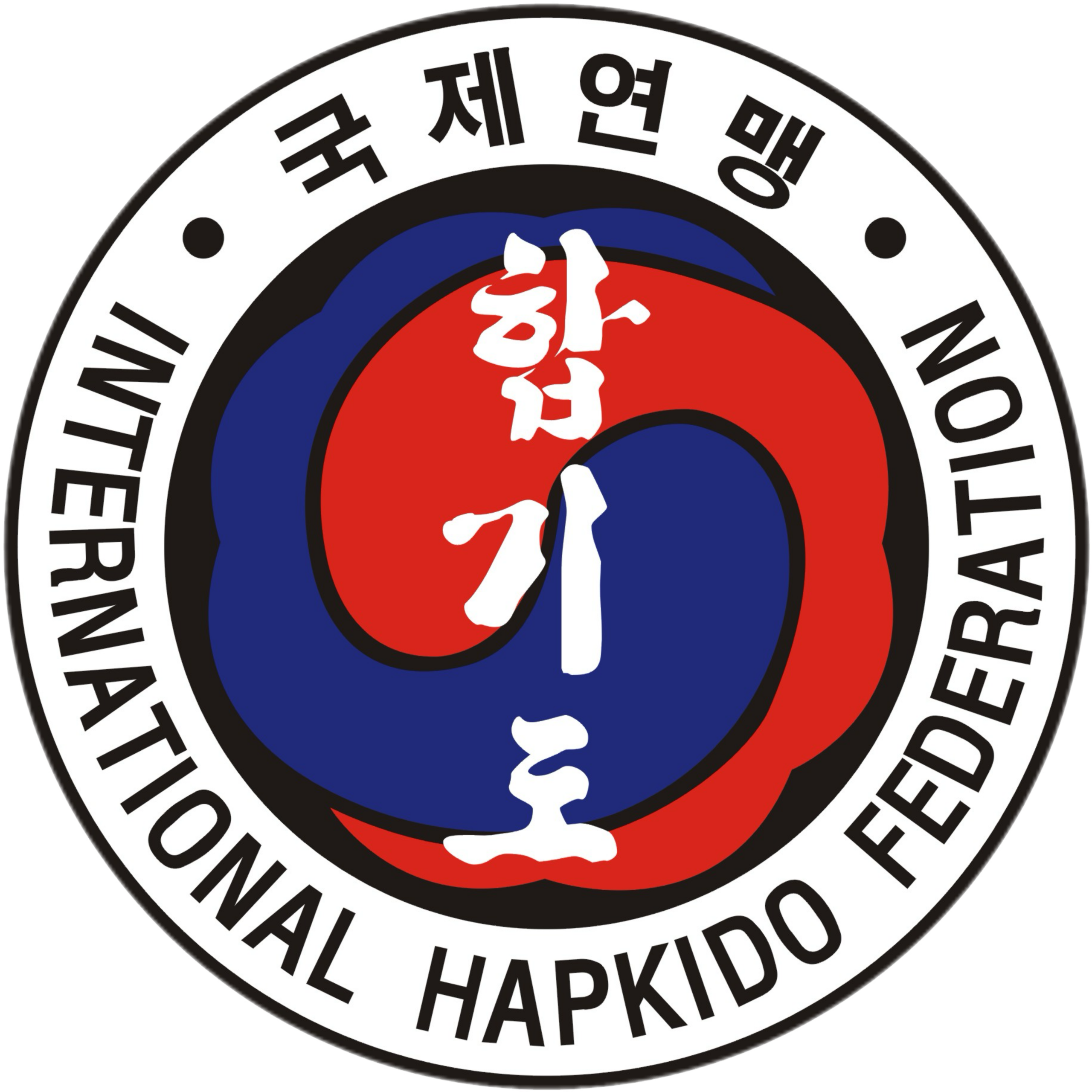
The Meaning of the IHF Logo
The colors of the IHF Logo are red, blue, yellow, white and black.
The color white represents peace and purity. The red and blue circle in the middle of the emblem is called “Taegeuk” in Korean. By dividing blue and red equally, Taegeuk unifies the principles of um and yang in perfect balance, um being the negative aspect rendered in blue and yang as the positive aspect rendered in red. They represent an infinite, continuous movement with the two merging as one.
The logo implies that the wearer is a person who demonstrates compassion and patience for others, someone who seeks to gain wisdom through his or her actions and associations.
All of the logo’s elements serve to guide IHF members as they develop their martial arts skills and their relationship with the world around them.